Simple tileset in Pyxel Edit
This tutorial shows the basic procedure for creating a simple tileset in Pyxel Edit. These will be nine tiles at 16×16 pixels. Such tilesets can be easily imported into e.g. Unity to create basic level layouts.
1. Create a new file by choosing File > New. Then select the Tiled document or animation tab. Choose 3 for number of pixels high and wide. Choose 16 pixels as each tile’s height and width. Before starting the drawing process mark all tiles using 0 tile from the Tiles area.
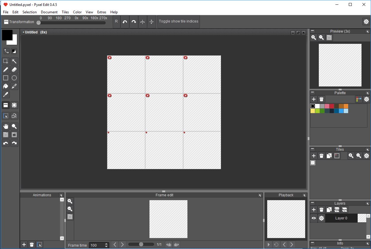
2. For simplicity, we will use the default color palette. Fill the canvas with the with the darkest blue color available in the Palette. Then select the darkest brown color and start drawing basic oval/round shapes for rocks. Try avoiding lines that are too straight, as they will look unnatural. Even though all 9 tiles should be now filled with content, these are instances of just one tile. You can see this in the Tiles pane. We now need to create instances for all the sides of the tileset apart from the middle one.
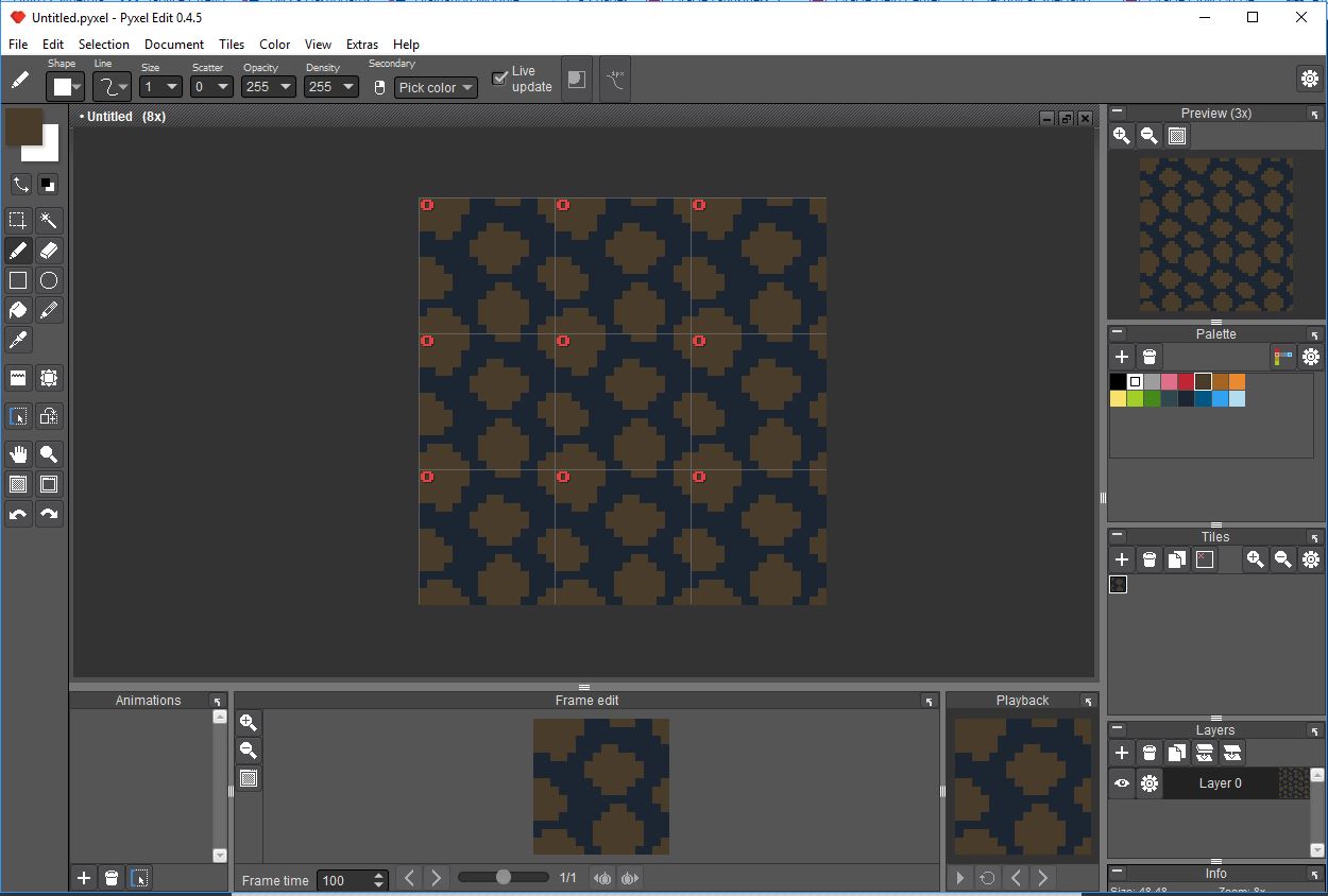
3. Select the only tile in the Tiles pane and click the Duplicate Tile button 8 times. This will ensure we have 9 tiles for the whole tileset. Even though now all these tiles are the same, we can start modifying them without losing any data.
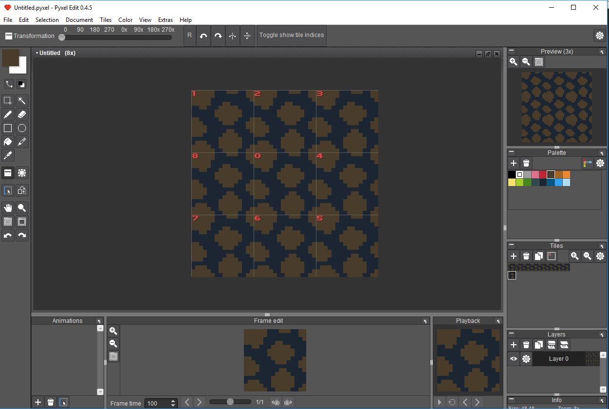
4. Before starting any drawing, select each tile from the Tile Pane and click any tile on the canvas in such a way, that each tile has a different index assigned.
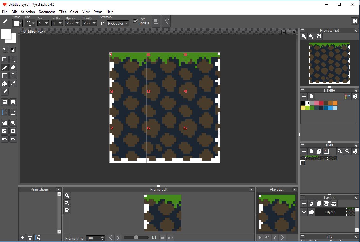
5. Now we can finally attempt to create the final look of the tileset. First, create a layer of grass at the top 3 tiles. Then, erase some color from left, right and bottom tiles, so that we can create walls and ceilings with the tileset.
6. Now it is time to add a little depth to the grass and rocks. Choose the second lightest brown and green colors and paint the default color for all rocks grass. This way, the basic color we used previously becomes the shade. Remember to avoid patterns which are too straight and too uniform. Also, always consider the source of light. The highlights should be placed consistently throughout the whole image. Otherwise, the image will look fake.
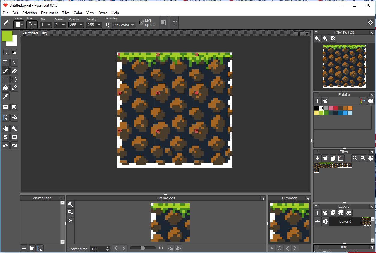
7. Finally add some highlights to both the rocks and the grass. Due to the limitations of the palette, I used yellow for highlights of both the rocks and the grass. In case of highlights the consistency with the direction of light source is crucial. Also, brightest highlights should usually be used sparingly. Remember to often zoom out, to see how the tileset looks from further away. Pixel art is nor really meant to be viewed from up close.
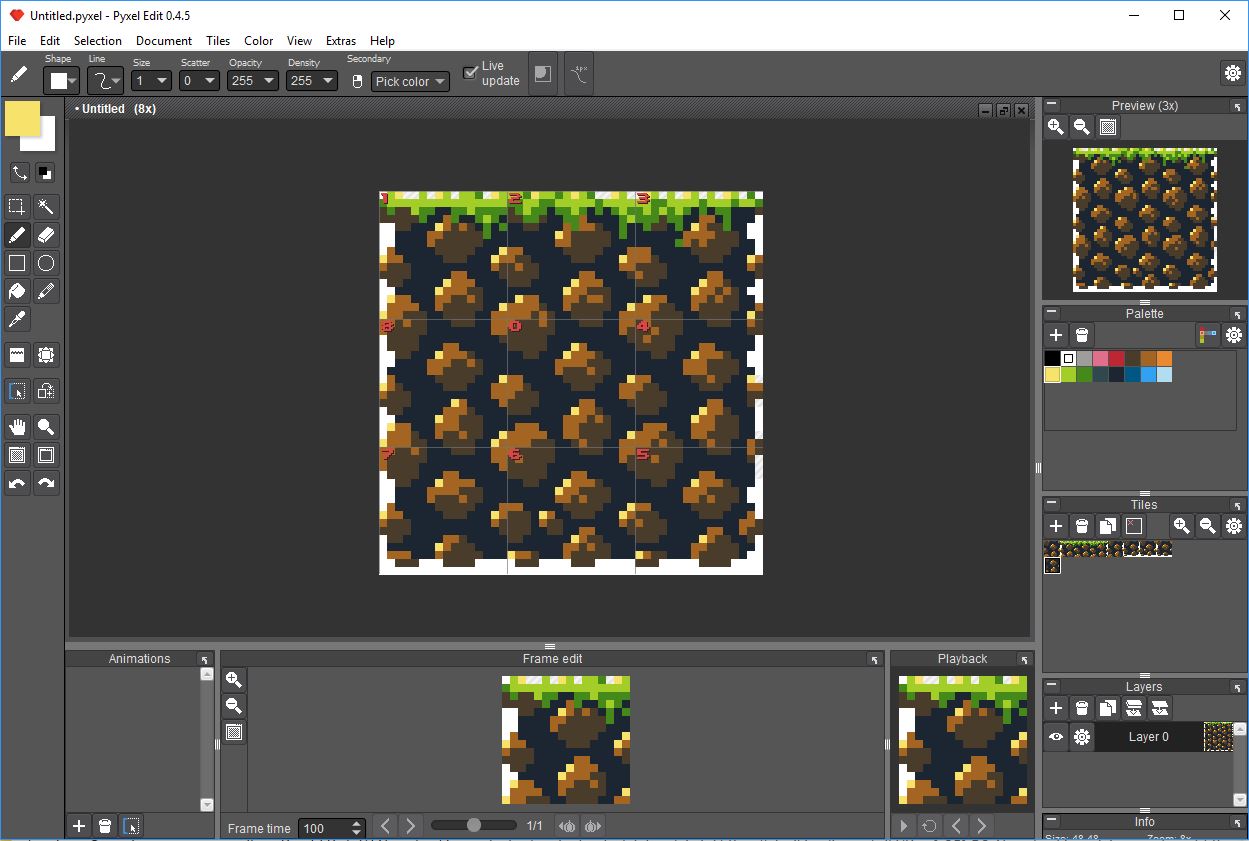
8. The tileset is thus almost complete. Some minor tweaks may be done to rock shapes or the general shape of wall, ceiling and grass patterns. To test if the tileset works, let us enlarge the canvas size and try to paint using the available tiles. To do this, go to Document > Resize canvas… and change the values for Tiles wide: and Tiles high: to for example 10. This will give us lots of area to experiment with.
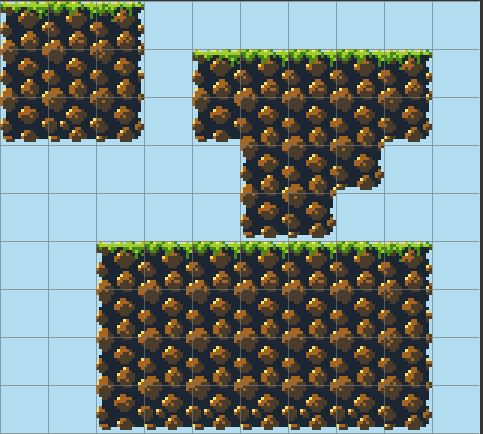
9. With all the extra space available, pick appropriate tiles from the Tile pane and draw shapes. Below is the result for my tileset.
10. Finally, go to File > Export tileset… to export the finished tileset for use in game engines.
My final tileset created during this tutorial is available for download in the Downloads section and may be used in any way you want.


ich möchte ein spiel erfinden